Introduction
Will you make your audience fall in love with incredible infographics? Infographics today are an important digital tool for conveying complex information fast. Let’s dive into the world of infographic design and see how to make your visual content shine.
Understanding Visual Communication Basics
Before diving into the actual infographic design tips, it’s really important that you understand first the basics of visual communication.
- Key of great infographics is visual storytelling
- Good infographics are a juxtaposition of data, design, and narrative
- Your objective is to simplify complex information into something easy to know and remember
The Strength of Visual Storytelling
- Human mind processes visuals 60,000 times faster than text
- Your stories help people connect with and remember your message
- Use storytelling in infographics (e.g., showing how a polar bear’s habitat has changed over time instead of just listing climate change statistics)
Core Ingredients to a Great Infographic
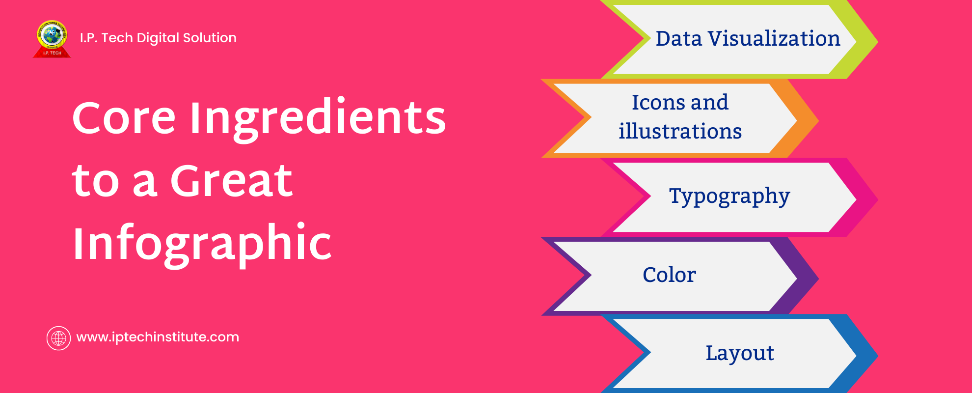
- Data Visualization: Choose the right charts and graphs for your data
- Typography: Use readable fonts that match your design
- Color: Use a consistent color scheme that enhances your brand and makes your content easier to read
- Icons and illustrations: Use them to add visual interest or to reiterate your message
- Layout: Structure information in a meaningful, easy-to-follow pattern
Best practice: Always start from your data and message. Make it your guide for designing the information, not the other way around.
Must-Know Infographic Design Tips for Beginners
Choose the Ideal Infographic Type
- Static infographics for most purposes
- Interactive infographics for more engaging user experiences
- Common types:
- Timelines for historical data or project planning
- Comparisons for product features or before/after scenarios
- Hierarchical for organizational structures or taxonomies
- Process infographics for step-by-step guides or workflows
- Geographic for location-based data or regional comparisons
Plan Your Layout
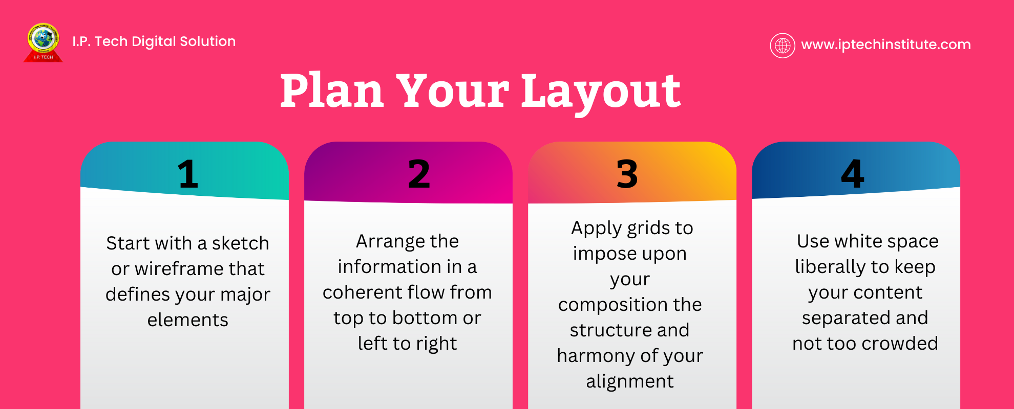
- Start with a sketch or wireframe that defines your major elements
- Arrange the information in a coherent flow from top to bottom or left to right
- Apply grids to impose upon your composition the structure and harmony of your alignment
- Use white space liberally to keep your content separated and not too crowded
Tip: Try the “squint test” – when you look at your infographic squinted, the important stuff should be prominent.
Set an Attractive Color Combination
- Utilize colors that embody your brand for continuity
- Ensure clear contrast for readability, especially between text and background
- Consider color psychology:
- Blue: trustworthiness, stability, professionalism
- Green: growth, health, environment
- Red: urgency, excitement, passion
- Yellow: optimism, warmth, and creativity
- Limit yourself to using three to five colors at most
Remember: Your color preferences can heavily impact the way your audience reacts or responds to your infographic. Choose carefully!
Advanced Techniques for Effective Infographics
Data Visualization Best Practices
- Select the right type of chart for your data:
- Bar charts for comparisons across categories
- Line charts for trends over time
- Pie charts for parts of a whole (use sparingly)
- Scatter plots for correlations of variables
- Keep it simple – don’t overwhelm with too much information
- Use standardized scales and legible labels
- Emphasize key data points
Typography Mastery
- Pair fonts for visual interest (e.g., serif headings with sans-serif body text)
- Use font sizes and weights to create clear visual hierarchy
- Ensure legibility at multiple scales
- Limit yourself to 2-3 font families for consistency
- Apply font styles (bold, italic) judiciously for emphasis
Tip: Use crisp sans-serif fonts like Arial, Helvetica, or Roboto for body text as they’re easy to read at smaller sizes.
Engaging Illustrations and Icons
- Use unique graphics to stand out from template-based infographics
- Maintain a consistent style throughout your infographic
- Balance text and visuals for maximum impact
- Use icons to convey concepts or categories instantly
- Ensure illustrations enhance your message without distracting from it
Remember: Each visual element should serve a purpose. If an illustration or icon doesn’t contribute to understanding, eliminate it.
Infographic Design Tools and Resources
Popular Infographic Design Software
- Canva: User-friendly with lots of templates, great for beginners
- Piktochart: Excellent for data-heavy infographics, offers many chart types
- Venngage: Good for business infographics, with a wide range of templates
- Adobe Illustrator: For more advanced designers who want full control
- Tableau: Powerful tool for complex data visualizations
Tip: Start with a user-friendly tool like Canva and move to more advanced software as your skills improve.
Finding High-Quality Visual Assets
- Use stock image sites like Unsplash, Pexels, or Shutterstock
- Find icons on Flaticon, The Noun Project, or Icons8
- Get inspiration from sites like Visual.ly, Behance, or Pinterest
- Use data visualization galleries like D3.js Gallery for chart ideas
Pro tip: Always check licensing requirements for any assets you use, especially if your infographic is for commercial purposes.
Optimizing Infographics for Different Platforms
Designing for Social Media
- Check size requirements for each platform:
- Instagram: 1080 x 1080 pixels (square)
- Twitter: 1200 x 675 pixels
- Facebook: 1200 x 630 pixels
- LinkedIn: 1104 x 736 pixels
- Create teaser images to encourage clicks on platforms with size limitations
- Use bold, eye-catching elements that stand out in crowded feeds
- Include your logo or website URL for brand recognition
Tip: Design your infographic in a modular way so you can easily extract sections for social media sharing.
Adapting for Print and Digital
- Use higher resolution for print (300 DPI) to ensure crisp images
- Consider interactive elements for digital-only infographics:
- Hover effects to reveal additional information
- Clickable sections to dive deeper into topics
- Animated charts to show data changes over time
- Test how your design looks on different devices (desktop, tablet, mobile)
- Ensure text is readable even when the infographic is scaled down
Remember: What works well in print might not translate perfectly to digital, and vice versa. Be prepared to create slightly different versions for each medium.
Measuring Your Infographic’s Impact
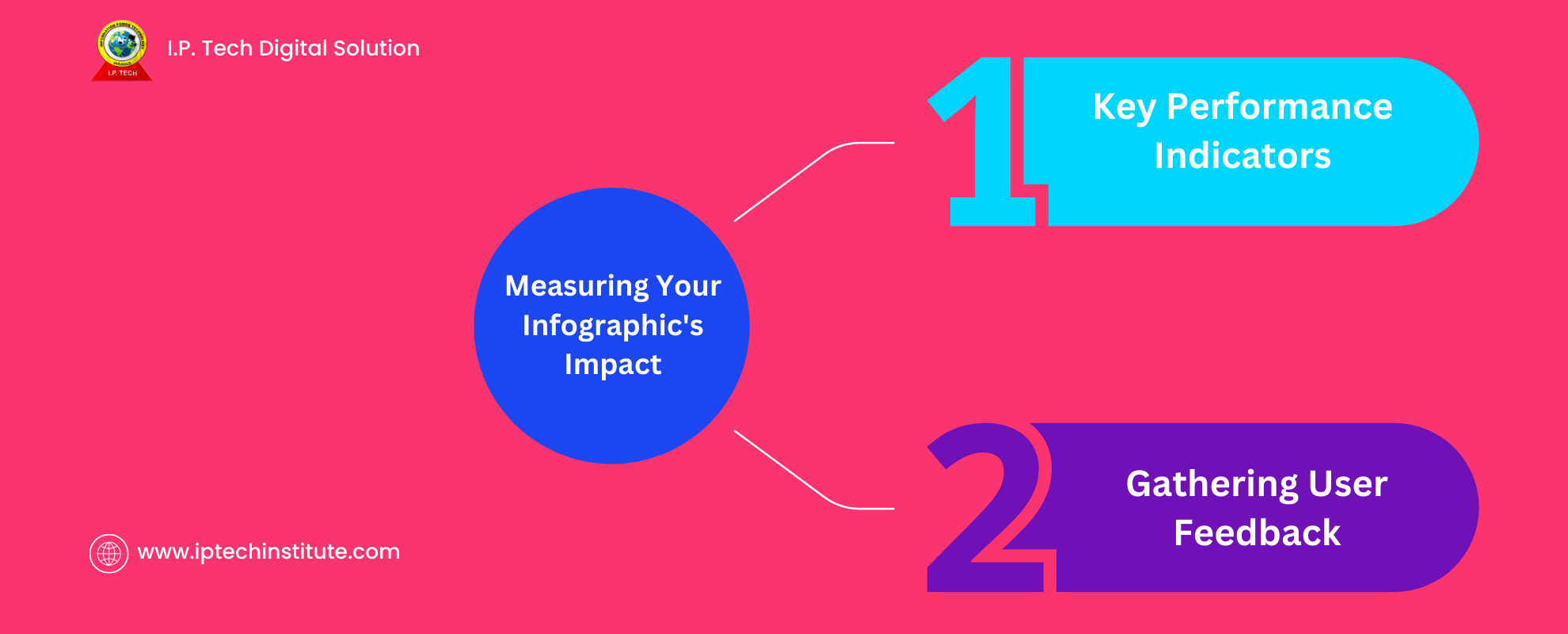
Key Performance Indicators
- Views and shares on social media platforms
- Time spent viewing the infographic on your website
- Click-through rates if you include links in your infographic
- Backlinks generated from other websites
- Leads or conversions attributed to the infographic
Use tools like Google Analytics, social media insights, and heat mapping software to gather this data.
Gathering User Feedback
- Use surveys to ask viewers what they liked or didn’t understand
- Monitor comments on social media for insights
- Use A/B testing to compare different versions of your infographic
- Conduct user testing sessions to observe how people interact with your infographic
Pro tip: Don’t just collect data – use it to continually improve your infographic designs.
Expert Tips for Infographic Design
- Focus on one main message per infographic to avoid overwhelming your audience
- Use white space strategically to make your design less cluttered and more focused
- Tell a story with your data – don’t just present numbers, show what they mean
- Keep your audience in mind throughout the design process – what do they care about?
- Use analogies or comparisons to make complex data more relatable
- Create a clear visual hierarchy to guide viewers through your infographic
- Use consistent styling (colors, fonts, icons) to create a cohesive look
- Proofread carefully – typos can undermine your credibility
Remember: The best infographics strike a balance between being informative and visually appealing.
How IP Tech Can Help with Infographic Design
- IP tech tools can help protect your original designs from unauthorized use
- Digital watermarking can deter plagiarism and track your infographics online
- IP tech solutions can monitor where and how your infographics are shared across the web
Why Choose IP Tech for Infographic Design
- Safeguard your creative work from plagiarism and misuse
- Easily manage licensing for your infographics if you want to monetize them
- Track the reach and impact of your designs across various platforms
- Prove ownership in case of copyright disputes
How IP Tech Solves Infographic Design Challenges
- Automates copyright registration for your designs, saving you time and effort
- Provides irrefutable proof of ownership if disputes arise
- Helps you monetize your infographics by managing usage rights and licensing
- Allows you to track unauthorized use and take appropriate action
- Provides insights into how and where your infographics are being used, informing future design decisions
Example: You create an infographic that goes viral. With IP tech, you can track its spread, ensure proper attribution, and potentially license it to companies who want to use it in their marketing materials.
Conclusion: Your Road to Infographic Design Success
Creating impactful infographics takes practice, but with these tips, you’re well on your way:
- Start with a clear message and strong, reliable data
- Use design principles to make your information visually appealing and easy to understand
- Choose the right tools and resources to bring your vision to life
- Optimize for different platforms to maximize reach and engagement
- Measure your success and keep improving based on feedback and data
- Protect your work and track its impact using IP tech solutions
Remember, the best infographics combine creativity with clarity. They tell a story, present data in an engaging way, and leave a lasting impression on the viewer. Keep experimenting with different styles, formats, and topics. Pay attention to infographics that catch your eye and analyze why they work well.
As you continue to create infographics, you’ll develop your own style and find what resonates best with your audience. Don’t be afraid to push boundaries and try new things – innovation often leads to the most memorable designs.
Ready to start designing? Grab your data, fire up your creativity, and create an infographic that wows your audience and effectively communicates your message. With practice and persistence, you’ll soon be creating infographics that not only inform but also inspire and delight your viewers.


